• Portfolio
  • About
  • Contact

Pet Pals Case Study

Every year around 6.5 million companion animals enter US animal shelters nationwide and about 1.5 million shelter animals are euthanized. Although 3.2 million shelter animals are adopted, which is good news, that number could be much higher. This is where Pet Pals, an association of pet shelters, comes in. They partner with shelters all over the country to raise awareness and discoverability to the work and pets waiting for a home.

  • ClientPet Pals, a UX Academy DesignLab project
  • RoleUX Research, IA, IxD, UI, and Visual Design
  • ToolsSketch, InVision, Photoshop, and Illustrator
  • Time Frame80 hours

Project Goals

01. Design a responsive website

The site should cover core functionality: search for pets, information about specific pets, and information about Pet Pals/shelters.

02. Create a brand identity

Pet Pals doesn’t have a defined brand, so they are also looking for a logo and visual assets.

Process Overview

01. Research

Research Goals
Competitive Analysis
Secondary Research
Interviews

02. Define

Persona
Product Roadmap
Sitemap
User Flow

03. Design

Wireframes
Logo Design
Style Tile
UI Kit
Responsive Site Design

04. Test

Low-Fidelity Prototype
Usability Testing
Affinity Map
High-Fidelity Prototype

01. Research

User Research: Understanding Motivations and Challenges

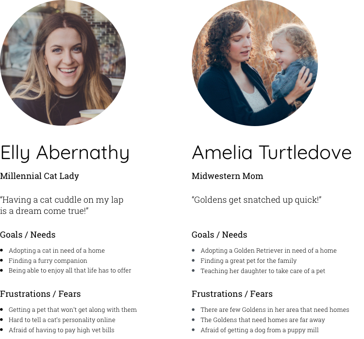
I interviewed seven people — four dog owners, two cat owners, and one person who is still searching for a dog.

Main goals for the interviews:

  • Understand what motivates people to get a pet and how they decide which pet to get
  • Learn about where people look for pets and about the adoption process they go through
  • Discover challenges and moments of delight people experienced when searching for their pet

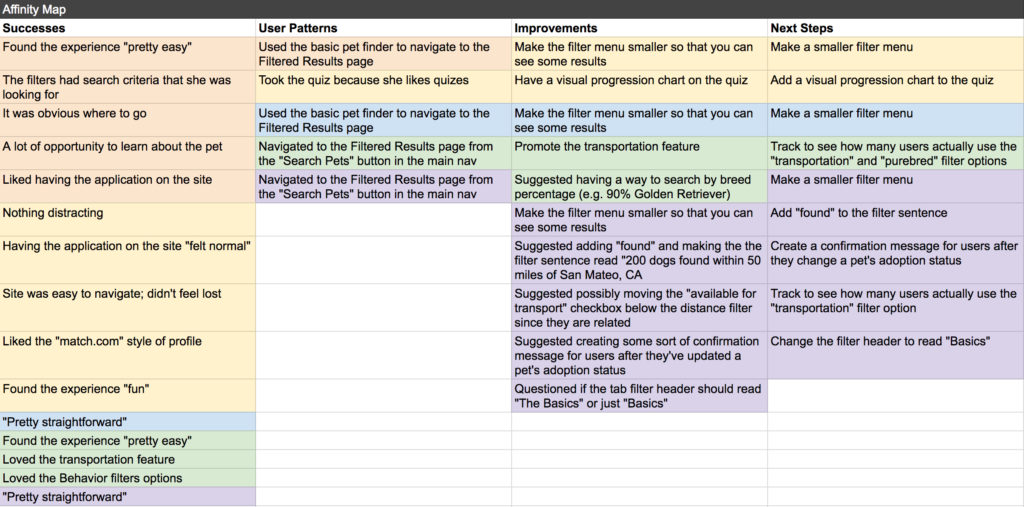
How do people decide which pet to get?

  • Most people have grown up with pets and have been wanting to get a pet for a while.
  • Those who got a pet for the first time as an adult got their pet because it was the first time that they had a steady job, were relatively stationary, and could provide for their pet.
  • Other important consideration when deciding which pet to get included the size of their living space, the cost of owning a pet, the pet’s behavior toward children, and their lifestyle.

Where do people get their pets?

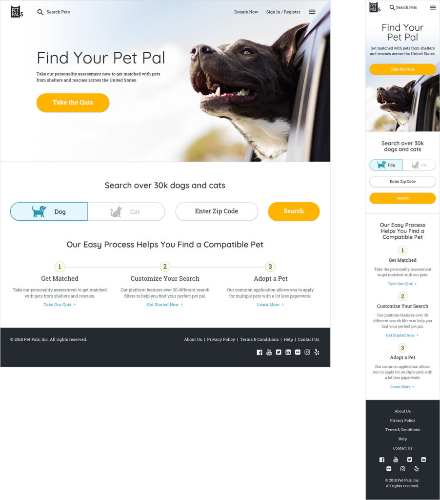
  • Everyone preferred adopting over buying a pet from a breeder.
  • Everyone initially searched for pets online through sites like PetFinder, but none of them found their pet directly on these sites.
  • Those who wanted a specific breed had the most challenges finding their pet: one couple ended up getting their pet through a breeder, and another couple adopted theirs from a breed-specific rescue organization.
  • People who adopted their animals directly from a shelter found the process the most straightforward.

What are people’s pain points in buying or adopting a pet?

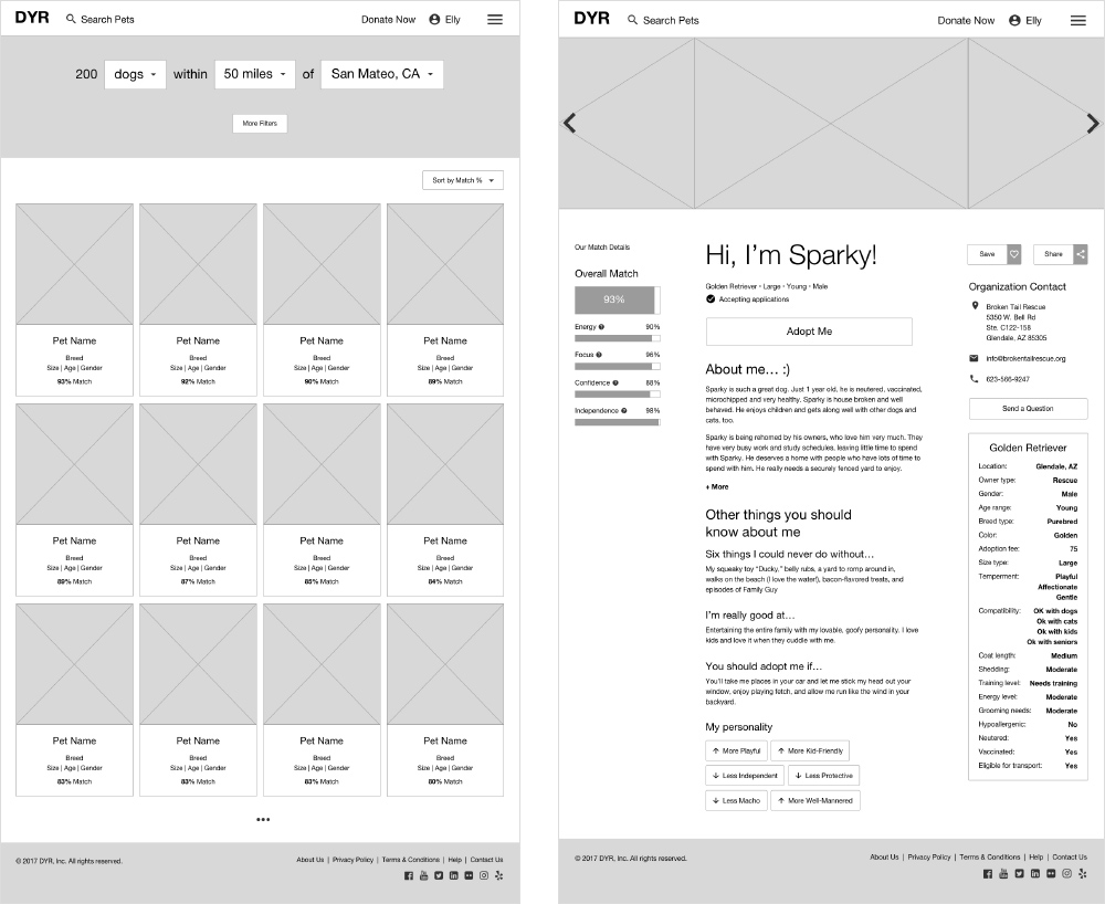
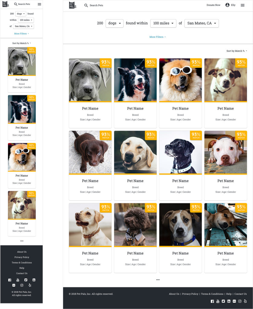
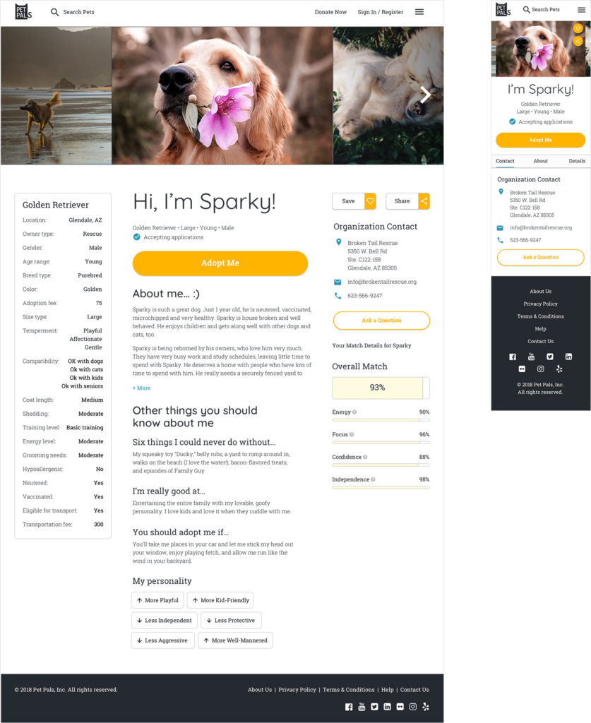
  • Online pet profiles weren’t updated regularly.
  • Their profile descriptions and photos could be much, much better.
  • Purebred pets were adopted quickly.
  • It was difficult to find animals that met their criteria and were local.
  • The adoption process was long (although people respected the process).

Competitive Analysis

I came up with a list of competitors based on Google searches and comments from the people I interviewed. Some of the topics I used to evaluate each site included: site purpose, primary navigation categories, search filters, personalization, competitive advantage, strengths and weaknesses, and design.

02. Define

Personas

From my interviews, I found that there were two types of users — one type that just wanted a pet that would be a good companion, and the other type that wanted a specific breed. For this reason, I developed two personas to help me develop the site.

Product Roadmap

After reviewing my findings from the user interviews and competitive analysis, I created a product roadmap, which detailed the features that I thought users would find helpful, and then prioritized the list. Some of the key features for the product included the following:

Get Matched
In order to help my persona “Elly Abernathy” find a compatible pet pal, I thought that the site should have a personality assessment that would match Elly with suitable pets, similar to the approach of many online dating sites. This would help users who just wanted a pet that would be a good fit.

Customize Your Search
For users like “Amy Turtledove,” who knew what kind of pet they wanted, the site should have advanced search filters. Users would be able to filter results based on qualities relating to a pet’s breed, behavior, and appearance.

Simple Application Process
In order to make the adoption process more straightforward for users, I proposed including a basic application on the site. A common pain point among the users I interviewed was that the process was long and involved too much paperwork. Having a basic application on the site would streamline the process and allow users to apply to adopt multiple pets without the extra paperwork.

Pet Transportation
To address another pain point of “Amy Turtledove,” I wanted users to be able to search for pets that are far away from them, with the option to have them transported to them.

Sitemap

With the list of features I was planning on including in mind, I created a sitemap to outline the sections and pages of the Pet Pals site.

User Flow

I created a user flow diagram in order to identify and visualize the two main flows that users would take in order to adopt a pet. The two flows are:

  • Users fill out a quiz first to get matched with pets, and then see their match results
  • Users just search for pets using filters without having to fill out a quiz first

03. Design

Wireframes

Since I wanted to show two user flows, which included a quiz and an application, and also show how a shelter would be able to update the status of their pets, I ended up creating over 70 pages of wireframes. Shown here are wireframes of the homepage, the opening section of the quiz, a filtered results page, and a pet profile page.

Logo Design

The original name for the pet association was “DYR,” but I thought the organization should have a name that sounded friendly and could be easily understood. After brainstorming different options, my top favorites were Pet Pals and Furever, and I decided to explore different logo options for those two names. I landed on a logo option for “Pet Pals” that was simple and would work well on different screen sizes.

Brand Identity

Before designing high-fidelity comps, I came up with a color palette and a couple typefaces that would work well together. I wanted the site to have a friendly and modern look and feel. For this reason, I decided to have a bright orange as the predominant color for the site, and use “Quicksand,” a san-serif typeface with rounded terminals, for headers, and “Roboto Slab” for body copy. From there, I created different visual assets for the UI kit such as buttons, input fields, and profile cards.

UI Design

Shown here are a few key desktop and mobile screens for the site.

04. Test

User Testing

With my wireframes, I created a low-fidelity prototype in Invision and tested it with five people, all of whom were pet owners. My main goal was to test the user flow and to see if they could navigate through the site and submit an adoption application. I also tested if they could log into the site as if they were a pet shelter volunteer and change a pet’s adoption status.

The participants were very positive about the features I had included on the site — namely, all the advanced filters, the online application, a pet profile that highlighted the pet’s unique personality, and the ability to search for pets that can be transported. Surprisingly, only one of the participants took the quiz. The majority told me that they knew what pet they were looking for and wanted to start searching right away.

After completing my user testing, I created an affinity map to help me summarize the results. My major takeaway was that I needed to make the height of the filter menu shorter, so that users could see more of the filtered results. The filter menu was covering too much of the screen, and as a result, it wasn’t clear to everyone that the displayed results were a result of the filters they were selecting.

High-Fidelity Prototype

The final step for this project was creating a high-fidelity prototype. Below is a screen capture of me clicking through the prototype, but you are welcome to explore the prototype on your own.

Test Prototype

Reflections

This case study was my first capstone project in the Designlab UX Academy curriculum. I had a limited time constraint of four weeks to complete most of the deliverables. I was able to experience the challenge of having a lack of resources, and learned how to manage my time, adjust my work, and prioritize in order to accomplish specific goals but still produce results that were high-quality within my given constraints.

My next steps for this project would be to roll out all of the UI design to approved wireframes, create another visual prototype to test the designs, and iterate on the designs as necessary.

Previous Project48mate Case Study
Next ProjectCapital One Case Study
© 2026 Maren's Portfolio Site — Digital, Print, and UX Design