Design a feature to help users better understand and manage their spending
The feature should embed within the current Capital One app in iOS.
The feature should embed within the current Capital One app in iOS.
Research Goals
Competitive Analysis
Secondary Research
Interviews
Persona
Journey Map
How Might We Statements
Product Roadmap
Application Map
Wireframes
UI Kit
Visual Design
Low-Fidelity Prototype
Usability Testing
Affinity Map
High-Fidelity Prototype
I interviewed seven people who use their bank’s mobile app and who have used Mint at some point to help them manage their finances.
Main goals for the interviews:
How do people manage their finances?
What are the pain points with their current method?
Features users would like to have:
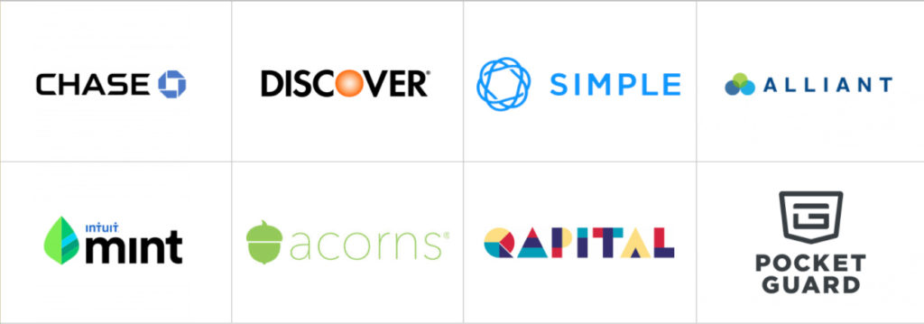
I came up with a list of competitors by researching which banks and Fintech companies were doing innovative things to help manage customers’ finances. I then read their customer reviews to see what people liked and disliked about these apps, and downloaded and reviewed them for myself.
From my interviews, I found that there were two types of users:
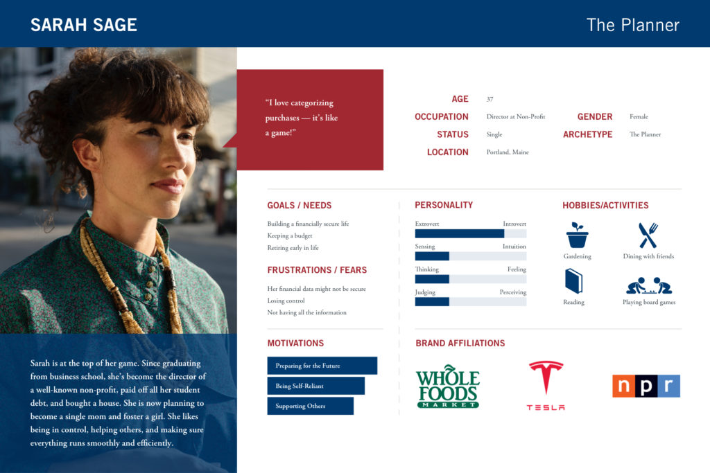
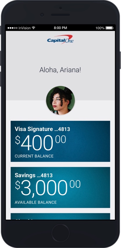
I developed two personas — Ariana and Sarah — to help me develop the app, but I focused on Ariana’s needs since they couldn’t be easily met with a budgeting tool like Mint.

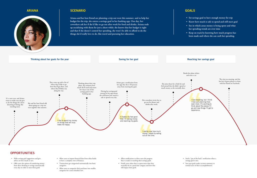
To help me empathize and understand the needs of my main persona, Ariana, I created a journey map for her. I knew that Ariana likes to travel, has certain savings goals, and that she has trouble saving because she likes to eat out. With that in mind, I came up with a scenario for the journey map that would involve these aspects.
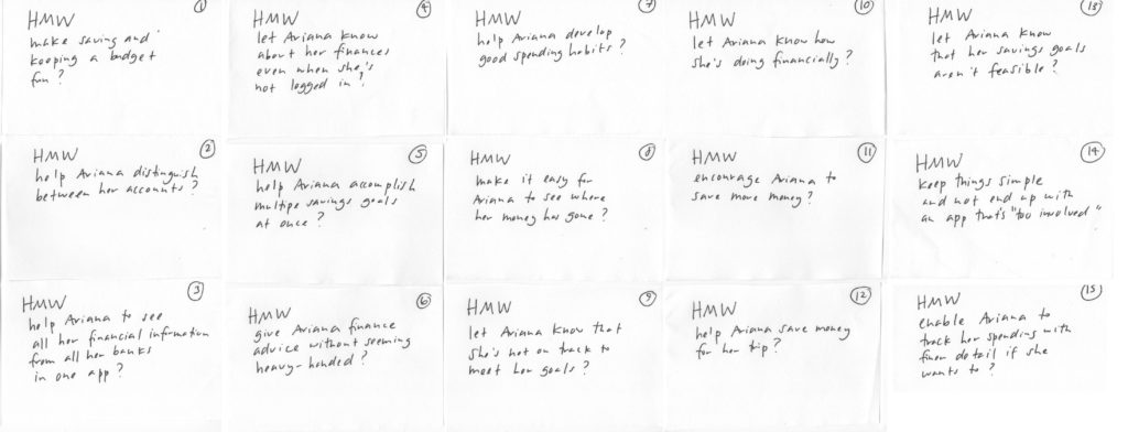
While the journey map helped me better understand Ariana’s needs, I decided to create a series of “How Might We” (HMW) questions to help me later brainstorm possible design solutions for the app. I came up with 15 HMW questions and decided to focus on these three questions:
After reviewing my findings from the user interviews and competitive analysis, I created a product roadmap, which detailed the features that I thought users would find helpful, and then prioritized the list. The top three features I wanted to focus on were:
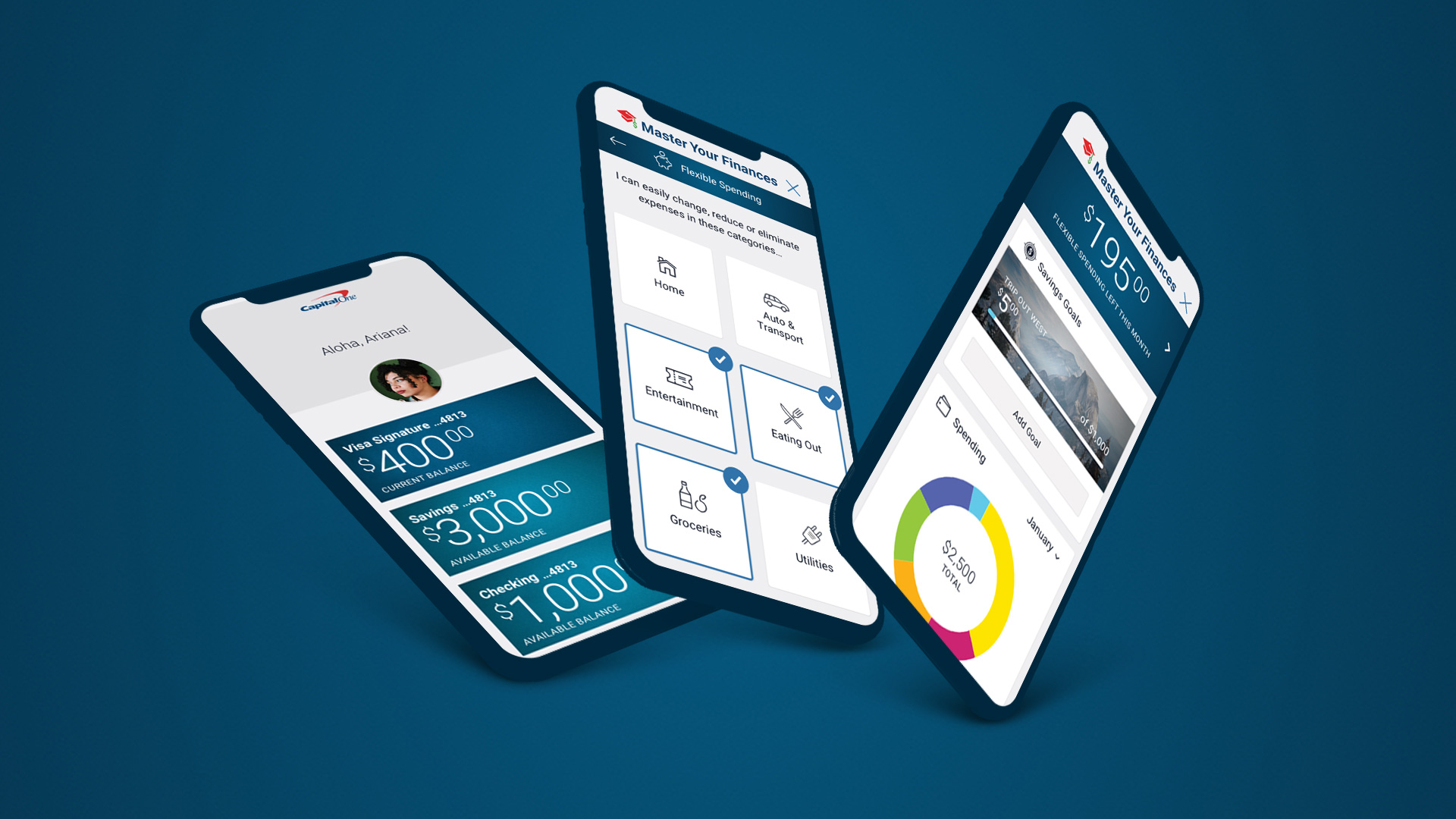
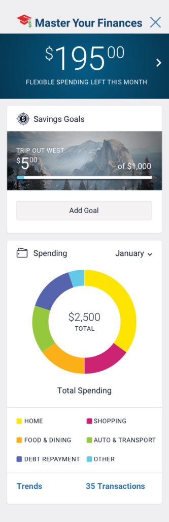
At a Glance: Money that’s Free to Spend
My main persona, Ariana, likes to spend money on eating out, but at the same time, wants to be saving more money. She wants her mobile app to tell her at a glance if she has the funds to eat out with her friends at any given time. For this reason, I wanted to come up with a simple way for her to tell how much money she is free to spend.
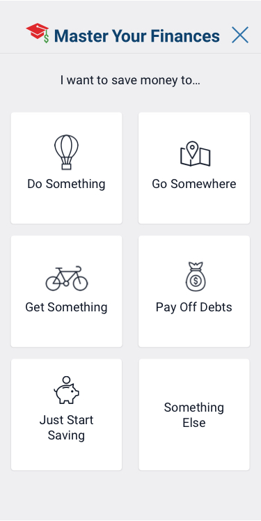
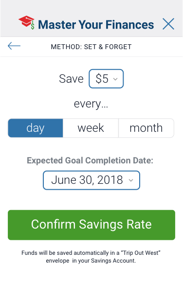
Savings Goals
Users told me that they want to feel motivated to save more, and getting notification on their progress would feel motivating. I wanted to give users a way to set their own savings goals and determine a date by which they’d like their goals to be completed. The app would then notify users on their progress.
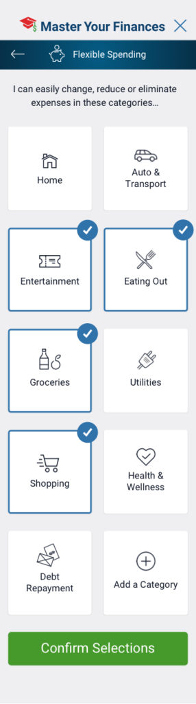
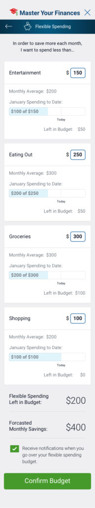
“Broad View” Budget Categories
Based on my interview findings, users would like to easily see where they are spending their money. Apps like Mint.com have been popular because they allow users to categorize their spending. Capital One already allows users to filter their purchases by category such as groceries, but I wanted to give users a quick way to see their aggregate spending within a category.
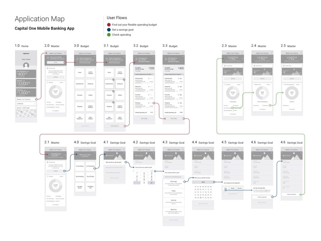
There were three flows I wanted users to take:
After creating my wireframes for the app, I put together an application map that shows the three user flows.
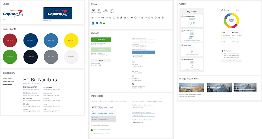
My personal finance management feature needed to be able to embed well with the rest of Capital One’s app. As a next step, I collected visual elements such as color swatches and icons from screenshots of the app, and put together a UI kit. With the UI kit, I was able to apply Capital One’s look and feel on all my application screens.
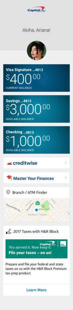
Shown here are several key application screens.

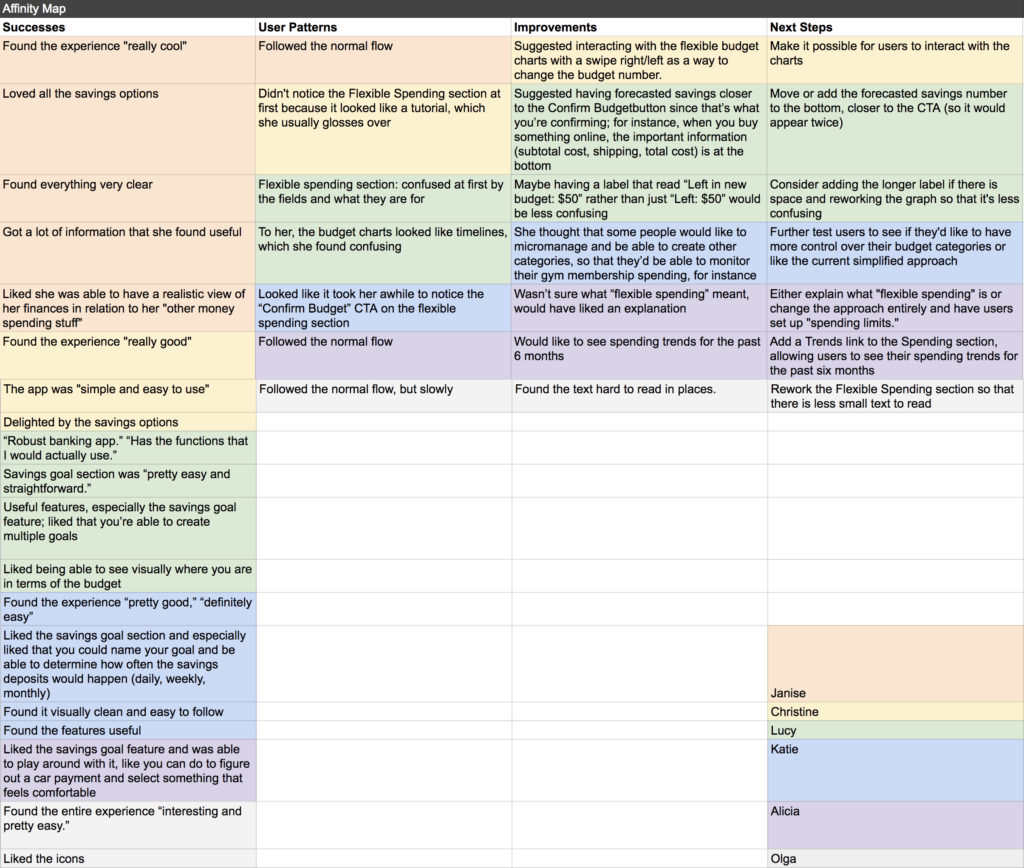
With my wireframes, I created a low-fidelity prototype in InVision and tested it with six people.
Overall, the testers had a positive experience. The tester I based my Ariana persona on told me she thought the app was “very cool.” She liked that she was able to get a lot of information at a glance that she found useful.
A few of my testers, however, had some trouble understanding the Flexible Spending section. Specifically, they weren’t sure what “Flexible Spending” meant and needed more clarification.
By far, the most popular feature was the ability to set up savings goals and be able to chart your progress. They especially liked that they were given a few different options for how they can meet their savings goal.
With the results, I drafted up an Affinity Map and charted out what my next steps would be.
The final step for this project was creating a high-fidelity prototype. You are welcome to explore the prototype on your own!
If this were an actual product, the next steps would be to conduct analysis and more user testing research on how people are actually using this new budget feature, and make the relevant changes to the interface based on user needs and behaviors.