• Portfolio
  • About
  • Contact

48mate Case Study

The Appalachian Mountain Club (AMC), the oldest outdoor group in the United States and publishers of the White Mountain Guide, needs a design for a mobile app that will encourage more hikers to get outdoors and hike the White Mountains’ 48 “four-thousand footers.” As part of their initiative for 2020 (“Vision 2020”), they aim to grow their membership to 100,000 and attract more young adults to AMC. They are hoping that this app will help reach new audiences and encourage them to form a deeper relationship with the AMC and the outdoors.

  • ClientAppalachian Mountain Club, a UX Academy DesignLab project
  • RoleUX Research, IA, IxD, UI, and Visual Design
  • ToolsSketch, InVision, Photoshop, and Illustrator
  • Time Frame80 hours

Project Background

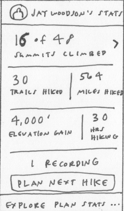
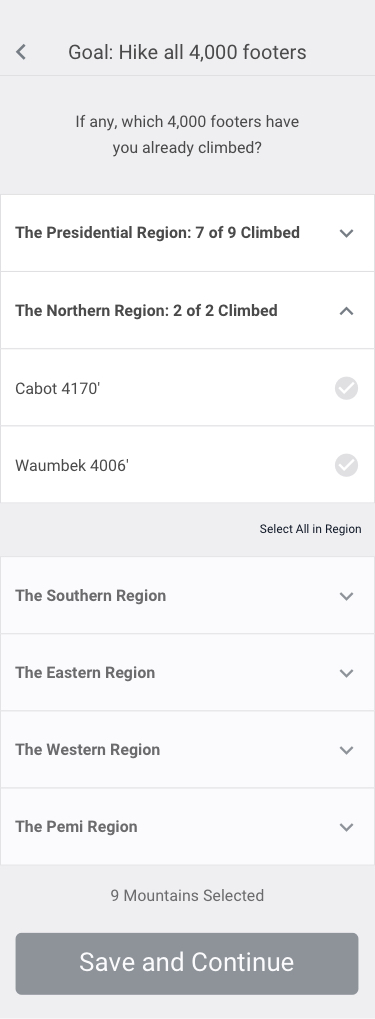
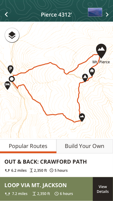
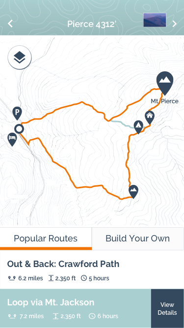
The White Mountains are a mountain range covering about a quarter of the state of New Hampshire and a small portion of western Maine. They are part of the northern Appalachian Mountains and the most rugged mountains in New England. In all, there are 48 peaks over 4,000 feet, known as the four-thousand footers.

The AMC formed the list of 48 peaks in 1957 as a way to introduce hikers to lesser known sections of the Whites, and in turn lessen the concentrated use of popular trails.

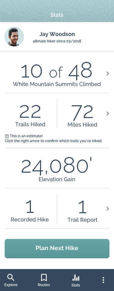
Today, the Club is composed of active hikers whose travels in the mountains keep us informed of changing conditions in the White Mountain backcountry. Each year, individuals, friends, and families, take up the pastime of hiking. Somewhere along the way they get hooked on the pursuit of hiking the four-thousand footers. For some it is done as a physical challenge. For others it’s an opportunity to pursue a shared goal. For families, it’s a way to build bonds that will last a lifetime.

It is the hope of the Club that these experiences will keep their members working for the preservation and wise use of wild country, so that it may be enjoyed and passed onto future generations undiminished.

Project Goals

Design and brand the hiking app

Process Overview

01. Research

Research Plan
Competitive Analysis
Secondary Research
Interviews

02. Define

Persona
Product Roadmap
App Map with User Flows

03. Design

Wireframes
Logo Design
Style Tiles
UI Kit

04. Test

Low-Fidelity Prototype
Usability Testing
Affinity Map
High-Fidelity Prototype

01. Research

User Research: Understanding Motivations and Challenges

I interviewed 7 people who have hiked in the White Mountains. Four had hiked all 48 mountains, one was almost done with the list, and two were far from being done, but hoped to finish someday. My main goals for the interviews were 1) to understand how hikers normally plan for their trips in the Whites and what challenges they face, 2) to learn what similar apps do to engage users and keep them focused on their fitness goals, and 3) to identify features the app should have.

How do people plan for their hiking trips?

Before going on a hike, most people consult the AMC’s White Mountain Guide, trail reports (especially if they are going hiking in the winter), and the summit report from the Mount Washington weather station.

What challenges do they face when preparing for trips and while hiking?

The biggest challenges are being properly prepared for the weather in the Whites, which can be horrendous, and the terrain, which can be rocky, steep, and full of roots. People had general concerns about getting injured/lost and running out of food/water, and were hesitant to use their phone on a hike for fear that they might not have enough battery life in an emergency. Other challenges included getting to the Whites when you don’t own a car and finding the trailhead.

Why would a hiking app be useful?

The people I interviewed had many great ideas for how an app could help them prepare and go on a hike in the Whites. The top features people wanted included: having a log of which trails and mountains they’ve hiked and and being able to read the latest trail reports and the weather report. Interestingly, while most people read trail reports from other hikers before going on a hike, few had actually submitted a report themselves.

Other features people wanted to be able to do: connect with other hikers, possibly for carpooling opportunities, build their own routes, see how popular a trail is, know where important waypoints are such as water sources and camp sites, book campsites or a bed in an AMC hut, and download maps for offline use. 

What would help people stay motivated to hike all 48 mountains?

Most people were motivated to hike because they loved being outdoors, exercising, being part of a hiking community, and feeling that they were accomplishing something.

Competitive Analysis

I reviewed hiking and fitness apps recommended by the people I interviewed. My analysis of the apps included their features, user likes and dislikes, and screenshots.

A number of the hiking apps offered a way to track where you are on a trail by GPS signal, to access maps off-line, and to evaluate a trail based on elevation, mileage and difficulty. Also, most of them offered just one route for users to take. The exception was the hiking app for the Appalachian Trail, Guthook. This app allowed users to create their own routes, although I found this feature cumbersome to use. People could also comment on waypoints such as whether or not a water source is dry, and see how far away you are from waypoints while hiking.

02. Define

Persona

From my interviews, I found two types of users: hard core hikers (those highly motivated to hike, who hiked in the Whites whenever they possibly could), and aspirational hikers (those who enjoyed hiking but hadn’t yet made plans to hike all 48 mountains). I decided to focus on the “aspirational hikers” since it seemed they could gain the most from a hiking app.

Product Roadmap

After reviewing my findings from the user interviews and competitive analysis, I created a product roadmap, which detailed the features that I thought users would find helpful, and then prioritized the list. The top four features I wanted to focus on were:

Trail Log
Users can see which trails and mountains they’ve already hiked.

Reports on Trail and Weather Conditions
Users can check out the trail and weather conditions for a hike they’d like to take.

Simple Trail Report Form
Users are easily able to report on trail conditions for other app users.

Most Popular Routes
Users can customize their hike by selecting from several popular hiking routes.

Application Map with User Flows

The flow I wanted users to take:

  • Create an account and set a hiking goal
  • Mark the mountains they’ve already climbed
  • Explore popular hiking routes for a particular mountain
  • Save a route and navigate it while hiking
  • Fill out a trail report on completion
  • Review hiking stats

03. Design

Wireframes: Sketches & Low-Fidelity Design

Once I determined the flow I wanted users to take, I sketched out what major elements should appear on each screen. From there, I mocked up low-fidelity wireframes in Sketch.

Logo Design

During my initial interviews, I asked people for name suggestions for the app. While there were a number of great ideas, I liked Maura McLaughlin’s suggestion best: 48mate. It was short, alliterative, and sounded friendly. For my logo sketches, I focused on creating a logo that made use of the mountainous shape of the letter “M” in mate. The chosen logo option does this and works well on a symbolic level as well; it has an image of a mountain with four peaks and eight sides… 48, get it?

Style Tiles

I mocked up a few style tiles to determine which color palette and typography option I liked best. Among these tiles, there is one that incorporates the look and feel of the Appalachian Mountain Club’s website (the app’s sponsor); the others also have colors that are nature-like and have a sans serif typeface, but have a different vibe. The two favorites were the third and fourth style tiles, which I called “Frosty” and “Forest.”

AMC website

Innovative

Frosty

Forest

UI Design

At this point, I was leaning toward using the color palette and typography I curated for my “Forest” style tile, but I still wanted to see how the app would look with the “Frosty” style as well. Shown here are a few key screens with the “Forest” and “Frosty” look. In the end, I went with “Forest” because I thought the dark green would appeal to our nature-loving hikers. I also thought that the all caps condensed serif typeface I was planning to use for the headers (Open Sans Condensed) was mountain-like.

Forest

Frosty

UI Kit

Shown below are the visual elements I used in the app such as color swatches, icons, and map design.

04. Test

User Testing and Results

With my wireframes, I created a low-fidelity prototype in InVision and tested it with five people.

Test Objectives

  1. Test if users can set up and personalize their account.
  2. Test if users can select and save a hiking route.
  3. Test if users can access and use the app’s navigation feature.
  4. Test if users can fill out a trail report.
  5. Test the flow and simplicity of the interaction.
  6. Locate where users have difficulty navigating or understanding the experience.

Test Results

All the testers were able to complete my tasks, and overall the testers had a positive experience. A couple users commented that they really liked the flow and thought it was intuitive.

While most testers loved the trip report feature, one tester found it “a little aggravating.” He said that he’s lazy and wouldn’t click on the “fill out trail report” button because it’s an extra step; he suggested instead having the form appear once he’s finished his hike.

For the personalize your account section, one tester suggested allowing users to select the mountains they’ve already climbed on a map. Seeing a mountain on a map would help him remember if he’s actually climbed it or not.

With the results, I drafted up an Affinity Map and charted out what my next steps would be: I’d further simplify the trail report feature and allow users to select climbed mountains on a map or from a list.

High-Fidelity Prototype

The final step for this project was creating a high-fidelity prototype. You are welcome to explore the prototype on your own!

Test Prototype

Reflections and Next Steps

As this project was done within a short time frame, the focus was on a few select features to have a Minimum Viable Product (MVP). My testers were nevertheless excited about the app and had a whole slew of features they’d like it to have. The plan moving forward would be to conduct more user testing research on how people are using the app, and over time roll out more features.

Next ProjectPet Pals Case Study
© 2026 Maren's Portfolio Site — Digital, Print, and UX Design