• Portfolio
  • About
  • Contact

Zeit Case Study

Zeit is a subsidiary of Richard Branson’s Virgin Empire. After a long struggle with Elon Musk, Virgin has been able to make time travel tourism available to all. Zeit is looking to create their new brand and set up an ecommerce responsive website in which they can sell travel packages to different times.

  • ClientZeit, a UX Academy DesignLab project
  • RoleUX Research, IA, IxD, UI, and Visual Design
  • ToolsSketch, InVision, Zeplin, Photoshop, and Illustrator
  • Time Frame120 hours

Project Goals

01. Design a responsive website

The ecommerce website should be easy to use and allow customers to browse through different trip categories and details.

02. Create a brand identity

The brand identity should be modern and historical at the same time.

Process Overview

01. Research

Research Goals
Interviews
Competitive Analysis

02. Define

Persona
Storyboard
Card Sorting
Sitemap
User Flows

03. Design

Page Sketches
Wireframes
Style Tile
Brand Logo
UI Kit
Responsive UI Design

04. Test

Low-Fidelity Prototype
High-Fidelity Prototype
Usability Testing
Affinity Map

01. Research

User Research: Understanding Motivations and Challenges

Main Research Questions:

  • Why do people want to time travel?
  • What do people look for in a travel company?
  • How do people choose an adventure?

Interviews

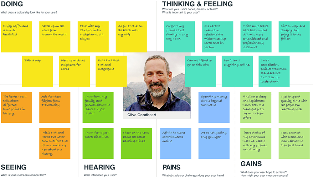
I interviewed five people over Skype who liked to travel and found that most of them traveled to escape and to have an adventure. Most of them also make travel decisions based on price and recommendations from friends, and they like to coordinate their own trips.

Competitive Analysis

I came up with a list of primary competitors that offer organized group tours, as well as a few secondary competitors that allow users to curate their own trips. While my persona Clive would be willing to go on an organized group tour, he’s more used to organizing his own trips and likes keeping his options open when traveling. For that reason, I thought it would be helpful to see how both types of competitors cater to their users.

Most of the primary competitors I reviewed offered tours that were led by a field expert or team of experts and had beautiful curated photography. In contrast, Trip Advisor, an online trip planning juggernaut, offered users a wealth of reviews and user-generated photos, but they weren’t curated and you had weigh the negative reviews against the positive ones.

02. Define

Persona

Personas help us relate to our customers, so we can make better design decisions to assist them with their specific user needs.

Based on my interview results, I developed the persona “Clive,” a retired school teacher and history buff. He has an adventurous spirit and seeks to learn all he can about different cultures and places.

Storyboard

Storyboard helps us understand what’s going on in our persona’s life and how our product can make their lives better. Here I narrated how Clive would potentially interact with Zeit in real life. I made up a scenario where Clive went on a trip with his daughter and met one of his heroes from history, Abe Lincoln.

Empathy Map

The goal of the Empathy Map is to better understand the mindset of my persona “Clive.” I created my map based on responses from Clive during our interviews.

Card Sorting

Card sorting is a research technique for discovering how people understand and categorize information. I asked six people to sort 30 cards with different time travel trips using the online tool “OptimalSort.” Although most sorted cards by time and destination, all my testers categorized information differently. Based on this finding, I determined that I should categorize my trips in multiple different ways on Zeit’s site.

Site Map

I created a sitemap to show the relationship between the content on the website. Since I found there wasn’t a clear way that people sorted trips, I decided to have menu options for the top two ways — by place and by time period.

User Flow

A user flow is a visual way to show a path a user takes through a site. Here I show the path a user would take to browse for and book a trip.

03. Design

Wireframe Sketches

Here are a few concept sketches for Zeit’s homepage. I decided to go with option #1, since it categorized trips in multiple different ways, which is important based on the results of the card sorting exercise.

Wireframes

I created wireframes for key pages of the site and included annotations to identify user interface elements.

Brand Logo

Shown here is my process for coming up with Zeit’s logo. The final design incorporates an hour glass that is also a “Z.” The wordmark uses “Cormier,” an art-deco themed typeface.

Style Tiles

I created two style tiles to hone in on the look and feel for the site. They included options for color palette, typography, photography, and patterns. Both styles have an art deco yet modern look. Why art deco? It was a time when people were excited about technology and travel, and it incorporated machine-like forms and patterns. I think it makes sense for a time travel company to have a style that is retro and especially a retro style that honors technology and travel.

The final design ended up using a bit from each style tile.

UI Kit

I created a set of user interface components for the website, which included art deco and modern sans serif type styles, a turquoise and lime green color palette, art deco patterns and ornaments, and ornate call to action buttons.

Responsive UI Design

I developed full color responsive comps based on the style tiles and branding work.

04. Test

High-Fidelity Prototype & User Testing

I created a high fidelity, interactive prototype in Invision and tested it for the following:

  • Can users navigate through Zeit’s website and book a trip?
  • Do people use filters to find their trip, and if so, how?
  • How was the flow and simplicity of the interaction for participants?
  • Where do users have difficulty navigating or understanding the experience?

Overall Findings:

  • Most people used the search bar or nav items to find trips.
  • Surprisingly, only one of my five testers used the trip filters. The majority didn’t because either they didn’t see it, they didn’t know how to use it, or they didn’t see how it would be useful.
  • People liked how information was laid out.
  • People liked the Compare Trips/Save Trips features.
Test Prototype

Reflections

The Zeit responsive website was my first ever experience designing a website following the UX design process, and it was extremely fulfilling for me to learn different research techniques and become familiar with the entire process. The main takeaway I had from this project was the importance of user research. It helped me empathize with the users I would be designing for, making the process feel more tangible and like a real problem was being solved.

Previous ProjectCapital One Case Study
Next ProjectLook & Feel for eBook Series
© 2026 Maren's Portfolio Site — Digital, Print, and UX Design